Evolving the Broken Healthcare System
ROLE
Front-End Engineer
COMPANY
Joany Inc.
Part of Joany's mission is to transform the way we think about and use our healthcare. While it's true that we don't think about healthcare until we actually need it (a broken bone, expecting a baby, etc.), we wanted to remove some of the the pains that come with using health insurance. From having to wait on hold for an answer on how much a simple doctor visit will cost to getting surprise bills and having to deal with them in addition to dealing with the actual medical problem.
These pain points would lay the foundation of Joany's concierge tool. We took data that we learned from a research study Joany hosted and picked the top most requested issues that customers would like some help with. Finding doctors, fighting bills, and checking the cost of prescriptions. The first iteration would take requests and generate tickets for our customer success team. We planned to then automate some of the features as traction gained.
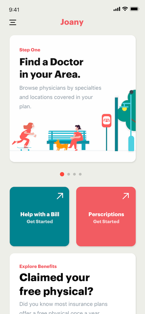
The Dashboard
The concierge dashboard was about developing a tool that customers can come back to and engage with Joany. The relationship with Joany doesn't end when someone enrolls in a health plan, that's when it begins. We wanted to give customers a place to come back and review the plan they enrolled in and see the benefits. The challenge was that most of our customers were already enrolled in a health plan, and pinpointing the exact plan they were on was difficult. Most people don't know the exact name of the plan they're on. This was a data entry/capture opportunity we didn't need to deal with today. We just wanted the first iteration to serve as something that can help people now. We'll worry about the details later.
Using the Style Guide
The welcome screen needed to be friendly and not overwhelm your average user. With Joany's new style guide, we stayed true to the card and rounded corners style to convey a friendly and easy to use experience.
Looking at how people are communicating, and develoiping for that.
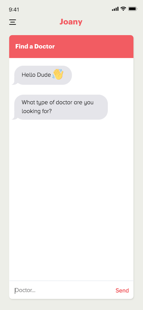
People communicate differently, not controversial. Whether it’s the medium they choose or the way they write or speak, there are often dramatic variances. Turns out people are unique, go figure. Keeping that in mind, we looked at the way people were communicating on the screen people use the most today, in-app messaging.
Designing for recognition
The categorization workflow was about improving the process of having a client comment on what an unknown transaction was for. Rather than sending them to another page to go track down and ask a question, we decided to overlay the workflow directly on top of the messaging feed by keeping open ended questions. This meant they could quickly jump back into the messaging feed. The chat was indeed scripted for the first iterations, there were plans on taking a customer response and dynamically serving responses based on the conversation, but we iterated on the design shortly after this version was deployed.
My Role
I worked on setting up the backend even prior to this iteration, the iteration above was a reskin to a version previously built as an MVP. The backend used Ruby with a PostgresQL database. This was the first time I had to set up anything like this from start to finish, so I will admit that I immediately had some thoughts on refactoring how we stored requests. The logout and creating Zendesk tickets for each request was set up by one of our Engineering managers. On the front-end, our senior front-end developer designed the file structure to be scalable, what a learning experience. We used React with Redux. My role on the frontend was to style the layout, the dashboard hero sections, and some of the chat interactions.
WORK
PERSONAL PROJECTS
Also, I enjoy riding my bike around town, going on local hikes, playing with my dog, and occupying coffee shops to work on perosnal projects and learn new tech.


