Developing a new home page to make sense of the diverse services of Joany.
ROLE
Front-End Engineer
COMPANY
Joany Inc.
Going into 2018, the product had changed quite a bit. At its infancy, the site would only be a place for shopping for health insurance, but nowhere on our site did we mention our core product, our concierge services. Solely based on the home page, people thought we sold insurance and that's it. You can't blame them, we didn't really advertise our concierge services anywhere.
We knew we had a style guide being established, as soon as we had the green light on the new style guide, we got to work on the new home page.
Saying goodbye to the old.
Our old site highlighted more the ability to compare and shop for a health plan in your locale. The concierge services were under the fold, and even so it wasn't very clear for those who didn't bother to read.
Paving the way for the future of the product using a new design.
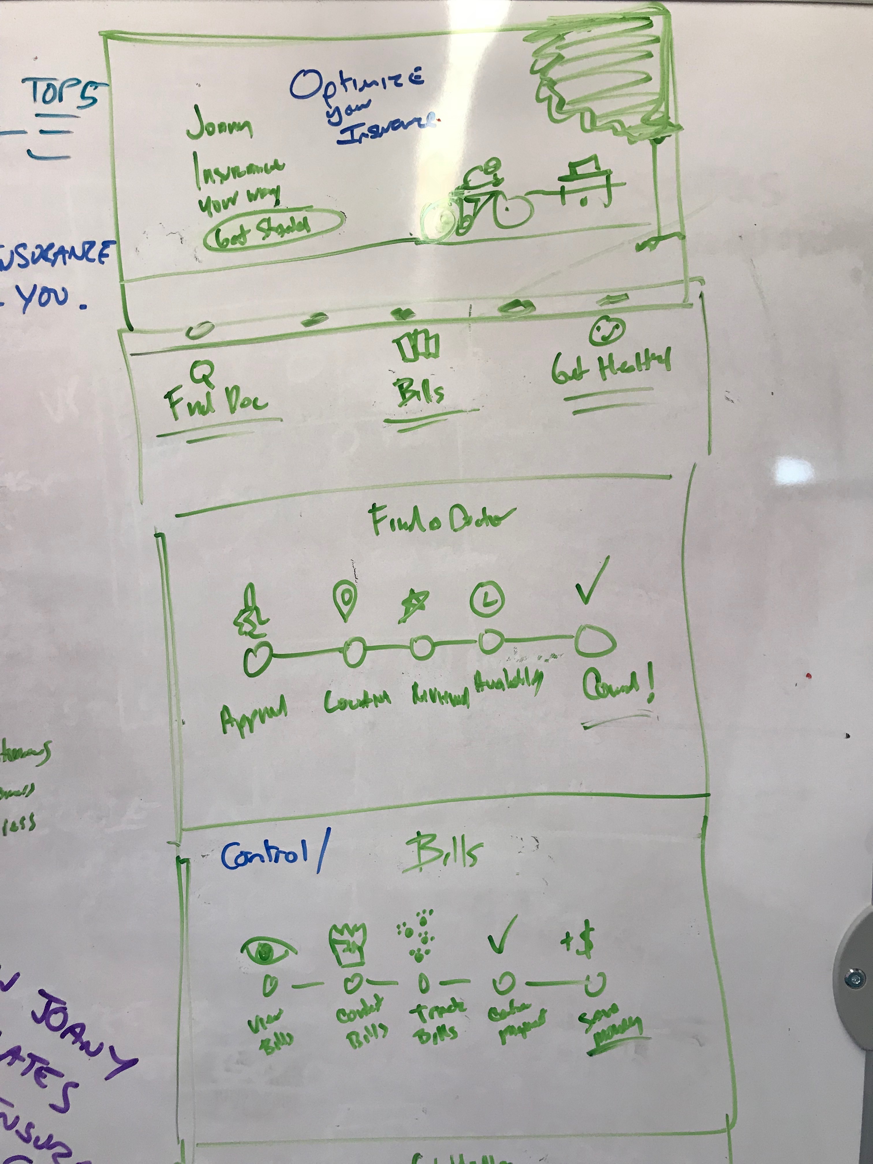
The Wireframe Stage
The product and the brand are deeply intertwined at Joany, as there should never be an inconsistency between the vision we sell in marketing, and the expectations of our product experience. We really wanted our home page to convey what that product was exactly. So we dedicated a section of the home page to an entire feature of our concierge service to really drill on who we are and what we're about. We also wanted to be very careful about the language that we used.
Language Direction
On paper, Joany is a health insurance broker, but what the heck is a broker? Why do people care? Surprise, they don't. We learned that words like 'broker' is just something people don't want to even think about when it comes to dealing with their health care. We had to be very careful with the language.
Illustrations
We used illustrations to give the brand a personality, and a voice. The illustrations were done by Tatiana Bischak (@darumacreative). The intention behind the blue character is to convey neutrality in gender, race, age. Part of Joany's mission is Healthcare for everyone. Mid Century modern furniture was purposely used in the illustrations for its clean lines with pops of color while bringing a timelessness feel to it.
The final product.
While there are hundreds of ways we can serve our members, it’s critical that we display clear and specific pain points that Joany can deliver on. We reiterated the copy based on different readability tool and continued to change it from tests and feedback. We wanted the text to be straightforward and easy to understand. Healthcare is challenging enough we don’t want to confuse or intimidate our members with high-level jargon.
My Role
I was solely in charge of converting the mockup to code. It was my first project using React with no direction, I learned a ton on component reusability. The styling was my absolute favorite part, especially when you work on a beautiful design like this one. I had a turnaround deadline of one week, which was feasible even though we had some mid-week blowups and damage control that came up.
WORK
PERSONAL PROJECTS
Also, I enjoy riding my bike around town, going on local hikes, playing with my dog, and occupying coffee shops to work on perosnal projects and learn new tech.


